Brand a–wear

Someone very helpful said to me recently that a brand is your jacket and I agreed. In this case it was a cycling jersey… 

The London Dynamo cycling club had decided to update their kit design, so being both a committee member and a brand consultant, I was naturally put forward to look at various solutions. This presented a unique opportunity to be both designer and client…


Jed Harrison at the kit launch


However to design a kit that was unmistakably on brand, classic, yet modern, and to satisfy 500+ members… a reversible approach was required. Club members were actively involved in the design process and invited to vote on the final designs. This approach proved to be a successful strategy as the wining solution pulled in a large majority of the votes.


Lillian Gray standing above Frafjord, near Stavanger, Norway. Photo credit: Mark Gray

A race win at Cyclopark for Lillian Gray


What I enjoy most about design and working on building a brand is that ideas can come from anywhere and anyone who gets involved in the process. I like to use my extensive experience to notice / recognise / find / and draw out these ideas and then look at what is and what’s not likely to work, and this is how I keep the process more about you than about the way I like to design.


Developing the kit design using the Sportful 3D visual tool

Dynamos about to set off for the Girona Granfondo


Emotion is the backbone of designs, it’s the fabric that holds everything together and I invest just as much into the process personally as my clients. Your brand is about you, your service or your product and this journey involved me too. Like a peloton, we were all along for the ride.


Jed riding towards the Rocacorba mountain in Girona

Girona Granfondo finishers. A well earned celebration! 


The collaborative effort of both designer and client, is to create something that stands out amongst its competitors, a cycling kit design has to do exactly this in a peloton of racers – you’d struggle to get a better visual metaphor. 

Bottom line, we wanted a kit to be be proud of and most club members are now wearing it with pride – which, I have to say, as a designer, is one of the proudest feelings I’ve ever had. We now have a modern kit that leaves enough room to evolve as the club moves into the future


Which brands are you loyal to?


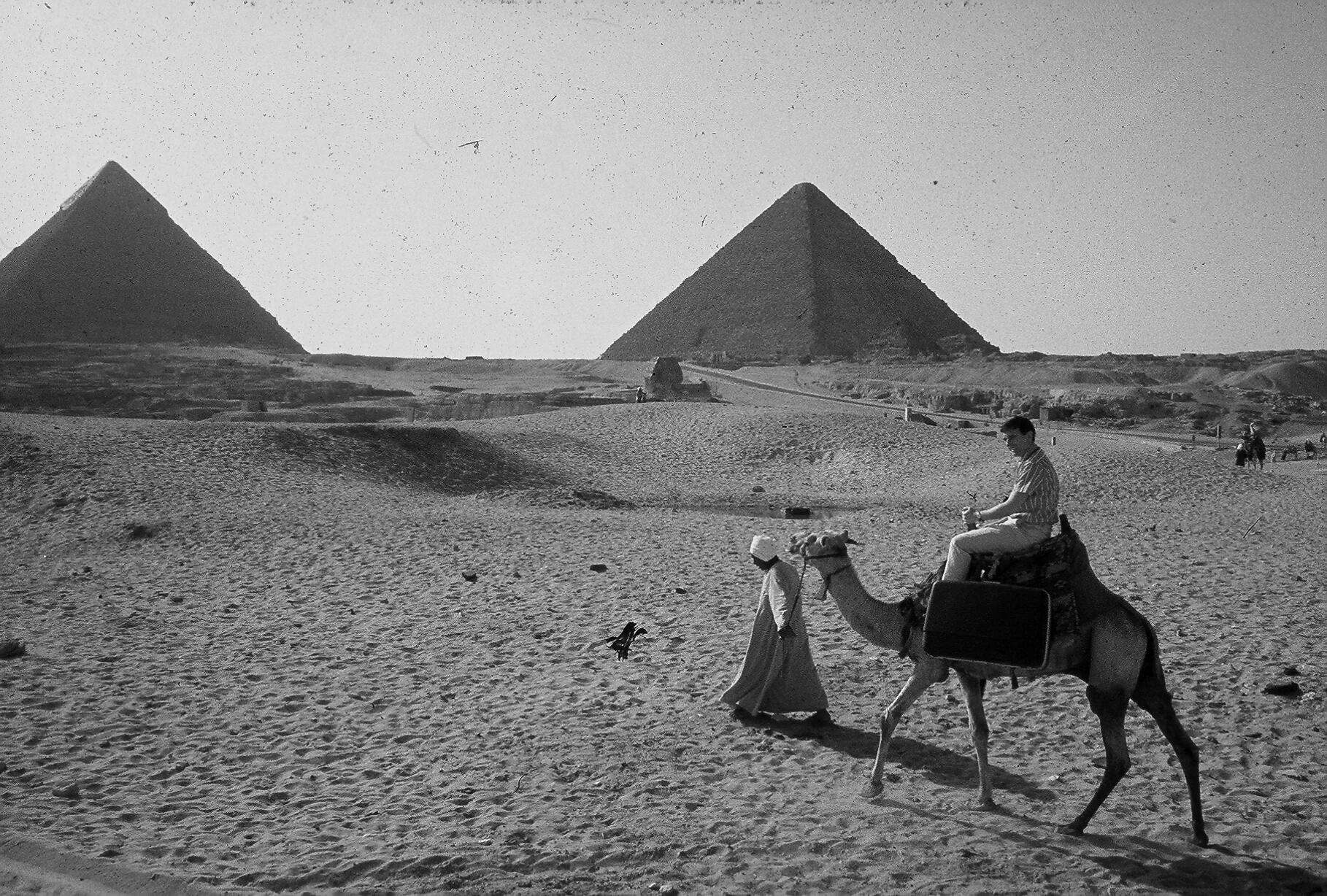
All my life, my father told me stories of his adventures during an Antler luggage campaign he worked on in the 1960s... and how he met my mother because of it. So whilst researching in preparation for the celebration of his life where we stumbled across the heritage section of the Antler UK website and watched the ‘Zenith Cases for Going Places’ film, we were amazed and delighted to see moving images of the man about town in New York, Mexico, Hawaii and Thailand to name a few. We had seen pictures from the ads of course, but he never mentioned the film. As he's is not with us any more it's intriguing to be able to see a part of his history that will always remain a mystery. 


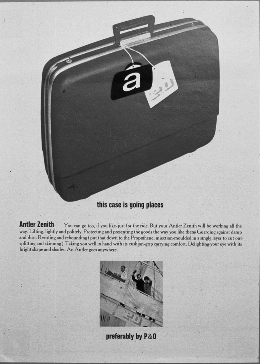
The final press ad showing a visual travelogue

In 1966 my father was working for Erwin Wassey, an advertising company based in London. One of their main clients was Antler Luggage and they had just launched their new Zenith cases, which were hailed as being extremely durable, up to any ’torture tests’ performed by 'the boffins in white coats'.  The heavy loads of an elephant at London Zoo and a Jaguar E-Type were classed at the extreme end. But that wasn’t enough, Antler were after a new campaign…


Hawaii

My future dad put forward an idea to Mr Ralph Wright of Antler Luggage to subject the Zenith to the stresses of round the world travel where they would be dropped, thrown and dragged through the world's baggage carousels. But the budget didn't allow for such a far reaching and adventurous campaign. The 60s was a time when more people were beginning to travel so far and wide for leisure, so the time was right. A meeting was arranged with BOAC (now British Airways), who agreed to sponsor and fund the campaign if they could add their strapline to advertisements. Two great British brands were ready to take on world travel and hopefully the Zenith Case was up to the task! 


Mexico

Now I’d love to tell you all the many stories my father encountered, but as luck would have it, before he passed away last year, he wrote a book telling where he tells his stories much better than I ever could. It’s available on Amazon and it is called A Suitable Case for Travelling by John M. Harrison. 


Rome

It's easy to be cynical about brand loyalty. From personal choice to popular culture, we research and think about what we want and this is where the knowledge and trust in a brand grows. It exists and serves our needs, impulses and of course the product and service based industries, which strive to influence and entice us. These behaviours develop from a variety of positive feelings.

I'm brand loyal to Antler, not just because they make great suitcases, they are the reason my mother and father met and so there's a strong case (sorry) that I would not exist if it were not for the Antler campaign. I would never had come into this world to have enjoyed his travel stories, as it was on his return trip on the campaign from New York in 1966 that he met my mother’s friend on the plane, who went home to tell her about a curious English man who travelled the world with smart looking luggage, who had so many interesting things to say and to be sure to look him up on the London leg of her European trip.  

For me, loyalty for the Antler brand is much more than a stylish and sturdy vessel for my belongings. It also symbolises a journey, adventure and storytelling past down through my family and friends and this has got me thinking. 

I'm interested in how and why meaning and emotional responses are present for you. Which brands are you loyal to and why? 

Additionally, maybe there's a new advertising campaign for Antler on past and future adventures with their cases. Antler UK, if you read this, I have just given you a great idea! 


John M. Harrison 1931-2016

When good design goes unnoticed


Lufthansa have recently introduced a new logo, identity and livery, designed in-house in collaboration with Munich-based Martin et Karczinski. The visual identity has moved towards the more premium end of the spectrum, placed where it should be and it has been warmly received by many. However, some people cannot get past the lack of yellow. The yellow was the memorable part of the original identity, the element that left the lasting impression of the brand. If you'd ask a member of the public which colour Lufthansa represented, you'd bet your house they would say yellow. So it seems that many people are mildly upset that the yellow is almost nowhere to be seen on their planes.


The iconic crane symbol has been re-crafted and the Lufthansa wordmark tweaked and kerned to perfection.


Colour plays different roles depending on the brand and there are all types of rationale for using certain colours. Lufthansa have taken their yellow and put it to work... and boy does it work. It's used as a wayfinder, a highlighter and other special items, so it improves the customer journey by grabbing your attention when needed.


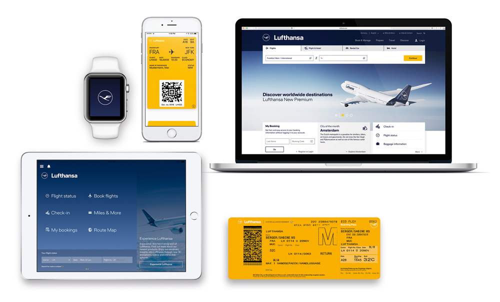
A cohesive brand doesn't stop at graphic design, the premium look and feel is extended to more tactile elements of their identity. 


When looking at a cross section of the old identity (shown below), you can see the look and feel is almost positioned with certain budget airlines. 


I am often asked, "how would you improve our brand?" Well for every design problem, there is a unique solution. For brands that are in need of a brand refresh, I would say that whatever the solution is, you must build on the good by making the most of the unique characteristics of your brand. It will enable you to evolve as you travel into the future. This is what Lufthansa does so successfully. At first glance, all the elements are the same, but when you compare back to the old identity, the major improvement is obvious to see. However, good brand design, signage and communication can go unnoticed... because it just works. Without realising, you arrive to your destination without losing your way.


"Much changes, good remains". says the in-house brand development team at Lufthansa. It's a mantra we could all follow... just imagine if we removed all that was not working so well for us in our life and then kept everything good... what an amazing Utopian world we would live in... ok so not realistic. But the beauty of good brand design, is that we can make an iconic brand almost perfect... Well Lufthansa can.